AGADOS, a traditional Czech brand with trailer production since 1992, presents a new logo and visual identity!
We are excited to introduce our new logo and visual identity! We believe it reflects our commitment to delivering straightforward and modern solutions.
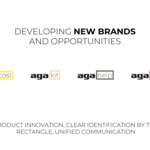
At the core of the new logo was the need to conceptually and visually unify our existing trailer portfolio, but more importantly to create space for emerging brands that represent products with specific customer groups.
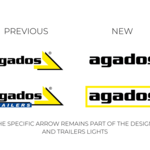
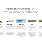
Like us, you may be nostalgic for the older logo, but the market drives us to look forward and keep evolving. We wanted to keep the change simple and easy to understand. We removed all the redundant elements from the logo and simplified the shapes. We made the bold decision to leave the arrow shape, but we will continue to use it in other design elements and our signature LED lights. The new logo is clean, punchy, symmetrical, but also more practical.
In the full version, the arrow shape has been replaced by a rectangle, which is versatile and timeless. In the new identity, the rectangle shape serves as a clear unifying element. This shape has also become a supporting element of the visual identity of the new brands that we will be introducing to you over time.
Please be aware that the transition to the new logo will be gradual so you may encounter the old logo in certain materials. Furthermore, it is still used on the majority of our trailers.
We believe the new look signifies our commitment to innovation and progress, and that we have made the right move.
We appreciate your patience and thank you for your continued support and partnership.


 Čeština
 Slovenčina

